Documentation Index
Fetch the complete documentation index at: https://base-a060aa97-pat-schemav2-docs.mintlify.app/llms.txt
Use this file to discover all available pages before exploring further.
Overview
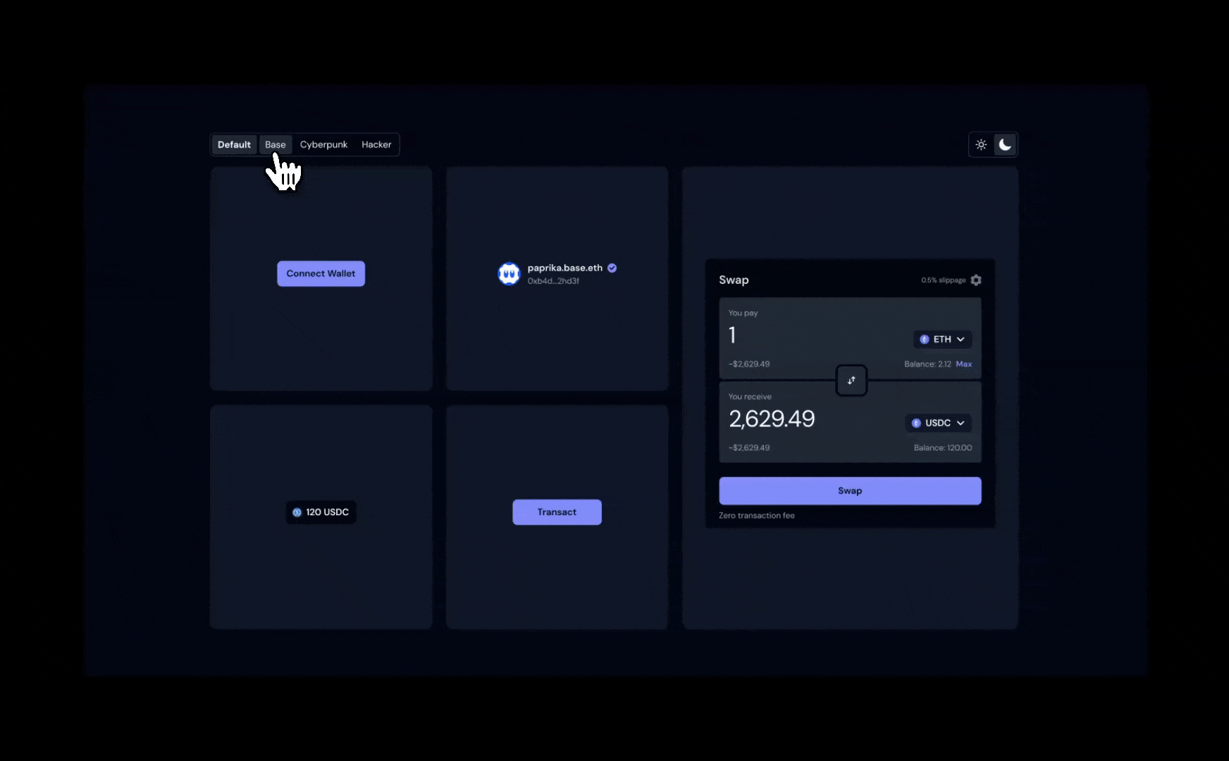
OnchainKit provides flexible appearance control through two main features: mode and theme.
- Mode: Controls the light/dark appearance with
auto, light, or dark options
- Theme: Sets the overall styling including colors, fonts, and border radius
Configure themes through the OnchainKitProvider to create a customized interface that matches your application’s design.
Built-in Themes
OnchainKit includes several built-in themes. Set the theme via the OnchainKitProvider using config.appearance.theme:
default: Multi-mode theme with light and dark variantsbase: Base brand colors, available in light and dark modescyberpunk: Dark-only theme with fuchsia accents and Oxanium fonthacker: Monospace theme with zinc colors and Noto Sans Mono font
If no theme is specified, the default theme is used.
<OnchainKitProvider
  apiKey={process.env.NEXT_PUBLIC_ONCHAINKIT_API_KEY}
  chain={base}
  config={{
    appearance: {
      mode: 'auto', // 'auto' | 'light' | 'dark'
      theme: 'default', // 'default' | 'base' | 'cyberpunk' | 'hacker'
    },
  }}
>
Mode
Control the color scheme by setting the config.appearance.mode property:
auto: Automatically switches between light and dark based on system preference (default)light: Forces light mode for all componentsdark: Forces dark mode for all components
Note: Single-mode themes like cyberpunk and hacker ignore the mode setting.
<OnchainKitProvider
  apiKey={process.env.NEXT_PUBLIC_ONCHAINKIT_API_KEY}
  chain={base}
  config={{
    appearance: {
      mode: 'auto', // 'auto' | 'light' | 'dark'
      theme: 'default', // 'default' | 'base' | 'cyberpunk' | 'hacker'
    },
  }}
>
CSS Overrides
Fine-tune specific aspects of an existing theme by overriding CSS variables.
@layer base {
  [data-ock-theme='default-light'],
  [data-ock-theme='default-dark'],
  [data-ock-theme='base-light'],
  [data-ock-theme='base-dark'],
  [data-ock-theme='cyberpunk'],
  [data-ock-theme='hacker'] {
    /* Override specific variables */
    --ock-font-family: 'Roboto', sans-serif;
    --ock-radius-default: 0.5rem;
    --ock-primary: #ff6b35;
  }
}
Custom Theme
Create a completely custom theme with full control over colors, fonts, and styling.
Custom Theme Setup
Define your custom theme using CSS variables. Theme classes should include -light and -dark suffixes for multi-mode support:
<OnchainKitProvider
  apiKey={process.env.NEXT_PUBLIC_ONCHAINKIT_API_KEY}
  chain={base}
  config={{
    appearance: {
      mode: 'auto', // Will switch between custom-light and custom-dark
      theme: 'custom',
    },
  }}
>
Theme Definition
Use the correct CSS variable names that match OnchainKit’s theming system:
@layer base {
  [data-ock-theme='custom-light'] {
    /* Typography and Shape */
    --ock-font-family: 'Inter', sans-serif;
    --ock-radius-default: 0.75rem;
    --ock-radius-inner: 0.375rem;

    /* Foreground Colors */
    --ock-foreground: #1a1a1a;
    --ock-foreground-muted: #6b7280;
    --ock-foreground-inverse: #ffffff;
    --ock-foreground-disabled: #9ca3af;

    /* Background Colors */
    --ock-background: #ffffff;
    --ock-background-hover: #f3f4f6;
    --ock-background-active: #e5e7eb;
    --ock-background-alternate: #f9fafb;
    --ock-background-alternate-hover: #f3f4f6;
    --ock-background-alternate-active: #e5e7eb;
    --ock-background-inverse: #f3f4f6;
    --ock-background-inverse-hover: #e5e7eb;
    --ock-background-inverse-active: #d1d5db;
    --ock-background-reverse: #1a1a1a;

    /* Primary Colors */
    --ock-primary: #3b82f6;
    --ock-primary-hover: #2563eb;
    --ock-primary-active: #1d4ed8;
    --ock-primary-washed: #dbeafe;
    --ock-primary-disabled: #93c5fd;

    /* Secondary Colors */
    --ock-secondary: #e2e8f0;
    --ock-secondary-hover: #cbd5e1;
    --ock-secondary-active: #94a3b8;

    /* State Colors */
    --ock-error: #dc2626;
    --ock-warning: #d97706;
    --ock-success: #16a34a;
    --ock-success-background: #bbf7d0;

    /* Lines */
    --ock-line: #e5e7eb;
  }

  [data-ock-theme='custom-dark'] {
    /* Define dark mode variables here */
    --ock-foreground: #ffffff;
    --ock-foreground-muted: #9ca3af;
    --ock-background: #1a1a1a;
    /* ... other dark mode variables */
  }
}